Warm Neutrals – A Timeless Trend
Pops of a trendy color will frequently inundate social media or grab your attention on the magazine stand. But, one color palette I am always happy to see take the spotlight is warm neutrals. While this color scheme is more of a “timeless trend”, I have had many clients requesting a home refresh with these colors recently. Statement colors will shine brightly during their respective seasons, but neutrals like tan, beige, cream, taupe, deeper browns, and a touch of black will always be in style. They create a calm, cozy interior which has been the impetus for my latest client requests.
A Family Room Reimagined
My client called me last year looking to refresh her family room. With her kids now off to college, we decided it was time for a sophisticated – but still comfortable – new look. We had not touched the space in years, so we wanted to create something just as long-lasting.
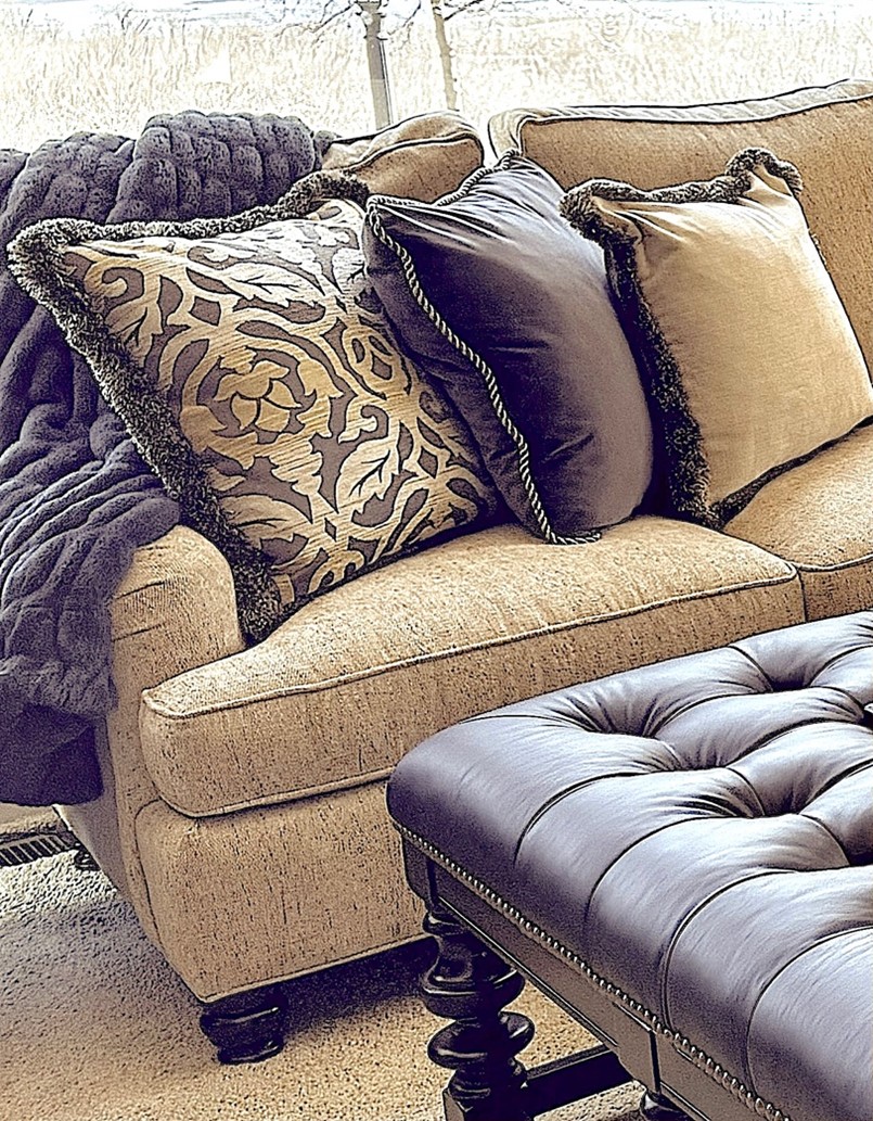
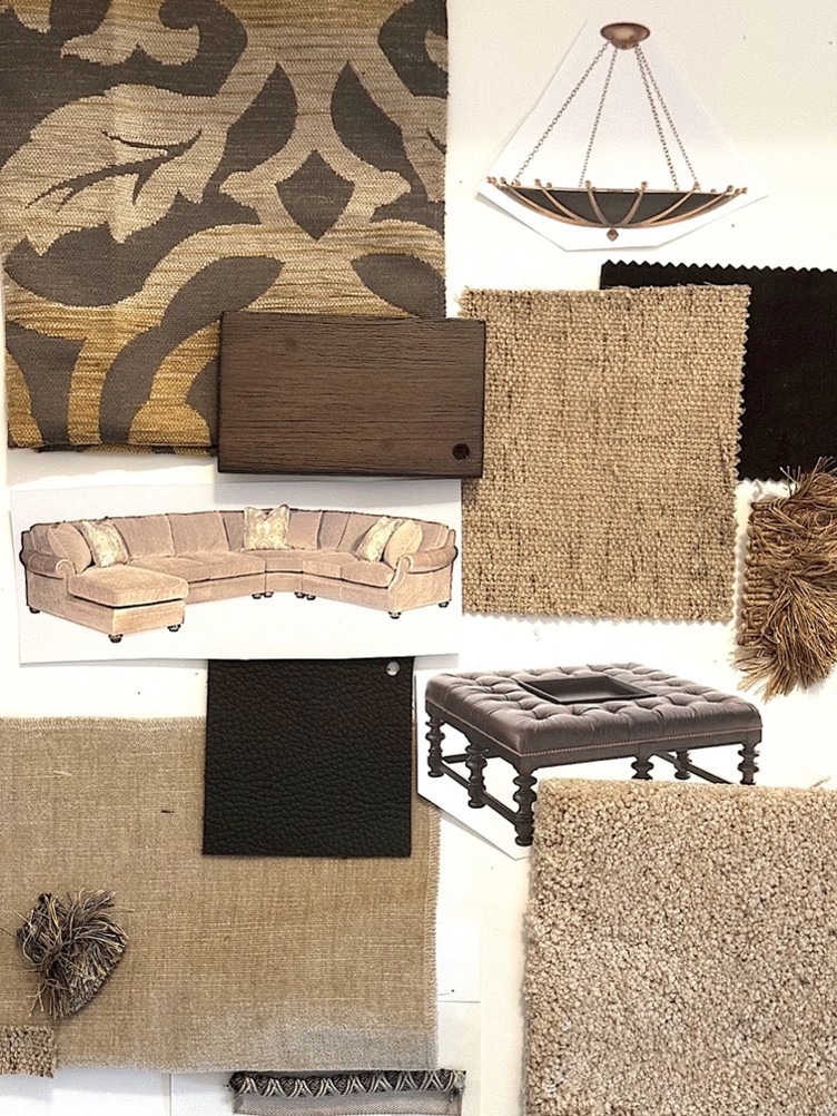
She asked for black accents, and there began my vision. I started with a new large pendant light fixture in black with gold accents. The piece shines soft light to the ceiling creating a beautiful ambiance with its warm glow. The new sectional is a warm beige tweed, with a centered black leather ottoman. We finished off the furnishings with an arm chair and ottoman upholstered in a stunning black and beige chenille fabric. I selected a group of throw pillows in fabrics and trims chosen with deliberate attention to how they enhance the sectional.
A Coastal Vacation Home
What says a new vacation home retreat better than easy, breezy, buttery neutrals? This color scheme for my clients’ main living and dining areas is purposely light, calm and relaxing from the minute my clients walk in the front door. The house has expansive walls of windows and a lush green view to the outdoors. This neutral palette is a soothing and cool for sunny days and warm temperatures.
With taupe used as the main color for most of the upholstery and leather chairs, I selected a mix of wood tones from rich mahogany to whitewashed ash burl. The area rug is a subtle abstract design, and cream semi-sheer casement draperies match the wall paint color and beautifully filter light in the day or provide privacy in the evening.
A New Life for a 1910 Historical Home
After finishing a client’s rambling Craftsman home in a wooded development, I was surprised to be invited by my clients to tour a 1910 house in the city with her realtor. The historic house was love at first sight for both my clients and me. Within weeks I was bringing their vision for the interiors to life. Neutral fabrics were a given, with their collection of Afghanistan area rugs and art. When my client expressed her interest in adding some drama with black accents, I was caught off guard but excited at the challenge! After weeks of considering various wallpapers for the foyer and stairway, the perfect wallpaper was chosen. We followed with a black leather ottoman for the living room, and I am having a black and beige custom wool runner made for the stairway.
The patterned wallpaper with a black background is perfect in this house. With many windows that face south giving lots of sunlight and plenty of contrast to the black with white-painted baseboards, wainscot, balusters and window casings. We continued the balance and contrast of the foyer and living rooms with gold foyer light fixture, ochre wall paint, a black mantel and new white marble fireplace. We are anxious to see it completed in a few months!
Some Final Tips
I like to choose one color as an accent in a room with a neutral palette. Such as adding a major piece of art with a color like coral, or green, or blue. This begins to establish that color as your accent. Then add a pillow, throw, ceramic bowl, etc., of the same color to cement the scheme.
Holidays are a great time to add décor in the color of the season and that will transform the room for a nice change.
Think about how you feel when you are wearing different neutrals. For instance, if you reach for khaki when clothes-shopping rather than camel, avoid camel-like beiges. Camel has more gold or red tones than khaki. If you own several off-white, cream-colored tops rather than crisp white, then you probably favor being surrounded by warmer tones in a room or your home. This analogy is a good way to assess your threshold for a neutral as well as any color before you begin to decide on a color scheme for your new room or home.